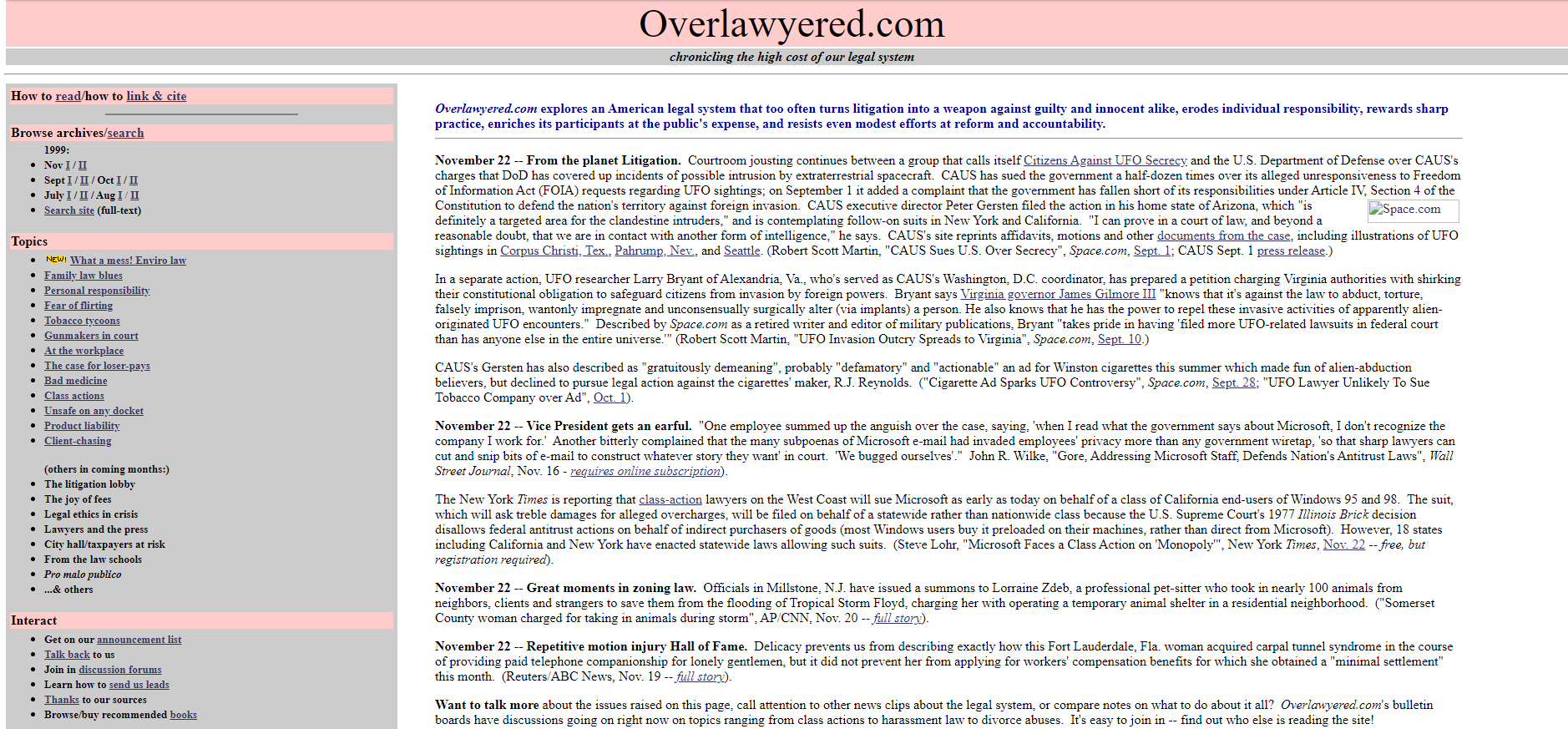
Longtime reader Jim Dedman reminds us of what this blog looked like in 1999:
As I noted when the blog turned 20:
Internet Archive’s first snapshot of the front page was taken Oct. 7, 1999, and featured the pink-and-grey color scheme that the site was to retain for many years. (Plus a webring — does anyone remember those? — an articles library, a discussion forum other than comments, and many other features since discontinued.) You can see the archives for the first half of July 1999 in Internet Archive form here.
In the site’s early years, there was no blogging software, which meant I hand-inserted every link one by one with HTML (I think Glenn Reynolds once described this method as “baked on clay tablets”). I had to make design decisions pretty much from scratch too. This resulted in a lot of homemade effects, from typeface choices to that notorious pink and gray color scheme, which was widely disliked but did make the site distinctive. Later, I moved the site onto the Movable Type and eventually WordPress blogging systems. In time, skillfully designed themes and templates became available that gave it a more professional look.
I tried to make the site a reasonably early adopter of technical innovations, but many of those were blind alleys. For example, before tags came along I lavished an inordinate amount of effort on something called categories. Blogrolls were a big social thing and source of traffic — we still have one, frozen in amber — until eventually they weren’t, after more people had begun to discover sites like ours through search and social media.
When the Cato Institute began publishing the site 10 years ago, it took over the back-end functions to my immense gratitude (thanks, Jeremy Kolassa and colleagues). This made a difference especially when WordPress would upgrade to a new version, something that used to absorb several days’ worth of my attention and often went wrong owing to my inadequacies as a techie.
One consistent theme over these nearly 21 years is the importance I’ve placed on the site’s archives. They were often the jumping-off point for my own later research into a topic, and I knew they reached a lot of journalists and scholars who would stumble across our coverage of some legal controversy from five or fifteen years earlier. Making the archives something intelligible and usable, rather than a mere jumble, could pose a special challenge whenever software upgrades altered the presentation of the site. One of the questions I’ve gotten most often in recent days is whether the archives will stay up, and I have confidence that Cato will do an excellent job on that.
Here’s another image (click to enlarge) of what the top of the site’s front page looked like in late 1999:

Longtime and other readers are welcome to share recollections of how the site used to look and work.
Filed under: about the site

